Showing posts with label art. Show all posts

Thursday, October 4, 2012

Signed/Sketched Copies of Bonds of Death!

The release of Bonds of Death is just about two weeks away, and I just finished signing my vellums to be inserted in the first 20 paperback copies sold through Dreamspinner Press's site!  And just like I did with the first 20 copies of Art of Death, I did 20 new sketches along with my signature for Bonds of Death.

The vellums got to me earlier this time, so I was able to put a little more time into the sketches as well.  I worked on them all through the presidential debate, but don't worry, there are no Obama or Romney portraits on the vellums. ;)  This time I did all characters and items from Bonds of Death.  So here they are!


1. Riley Burke
2. Westwood
3. Porter Gomez
4. Arman
5. Quinn Harcourt
6. Charlotte
7. Rico
8. Chester
9. Lucy
10. Jasmine
11. Riley Burke 2
12. Porter Gomez 2
13. Westwood 2
14. Arman 2
15. Quinn Harcourt 2
16. Thackary Jones
17. Red Wine
18. Westwood 3
19. Riley Burke 3
20. Porter Gomez 3

Riley, Westwood, Porter, and Quinn of course were all in Art of Death, and Thackary was mentioned, but the rest are making their first appearances.  Charlotte happens to be the central character in my very favorite scene of Bonds of Death—which is actually probably my favorite scene out of any I've ever written.  And I love Rico.  Arman didn't come out exactly as I imagined him....  Sometime I'll have to do a full painted portrait of him.

Anyway, I'm really excited about being able to have these sketches in the first 20 paperbacks.  They'll be available through the Dreamspinner Press site starting on October 19!

Tuesday, June 26, 2012

Signed/Sketched Copies of Art of Death!

We're now less than a week away from the release of Art of Death!  Those of you who have bought from Dreamspinner Press before might already know that the first twenty customers to buy a paperback through their site can often get a signed copy.  Well, I should have probably warned the Dreamspinner folk that if they put a piece of vellum in front of me, I'm going to draw on it. ;)

I just finished up with 20 signed original ink sketches, and they're on their way back to Florida to be inserted into the paperbacks.  So that means that the first twenty people to buy a paperback copy of Art of Death through the Dreamspinner Press website will get a signed copy WITH an original sketch!

The sketches will be given out at random, so unfortunately there's no way to request a specific sketch.  But I hope the twenty of you will enjoy what you get!  FYI, here are the sketches:


1. A ferret
2. An angry cockatoo
3. Porter #1 (Art of Death)
4. Pogo #1 (DOTU)
5. Riley (Art of Death)
6. Westwood (Art of Death)
7. Samsid (DOTU)
8. Pogo #2 (DOTU)
9. Ebo the cockatiel
10. A dandelion puff (an homage to Porter)
11. A dumb fat bird
12. A dumb kiwi
13. A weird turtle with a birthday hat
14. A snowman with a pitchfork
15. Porter #2
16. Random profile of guy with swooshy hair
17. A cockatiel in a tree
18. A sheep standing on a wedge of cheese
19. A sheep getting yelled at by a bird
20. A linseed oil bottle with a red liquid inside, and a paintbrush

Here's another photo:


Because I seem to have identity issues, the images are each signed "Ana Bosch," but they also include my initials and "Bob," which is how I sign all my artwork.  Each piece of vellum has also been imbued with magical powers via the oil from my fingers, after which the sheets were rubbed all over my chest.  (Okay, that last part didn't actually happen.)

The signed copies will be available starting July 2 here on the Dreamspinner Press site.

Thursday, May 3, 2012

Art of Death - The Cover Reveal


Okay, I deeply apologize for "cockteasing" you guys all week, as it's been said! ^_^  So here it is!  The cover art for Art of Death!  Click here to see it all giant and big!


I occasionally still giggle when I look at this.  I'm like, "Yo, Riley.  Why're you standing around half naked with a bunch of fruit?"  But at the same time, it all makes such perfect sense to me!  Nude model at an art school?  Then yes, this is life.

The first edits are now back with the publisher, and I'm excited at the prospect of soon having a pretty manuscript to go with the (imho) pretty cover!

As mentioned, I plan to do a 12"x18" glossy print giveaway in the next couple months.  Keep an eye on my blog or Facebook page for details in the near future!

Wednesday, May 2, 2012

Countdown to the Art of Death Cover Reveal! #1

We're down to the last preview before I reveal the Art of Death cover art tomorrow!  As some of you may know, I like to post "ridiculously cropped WIPs" of my cover art in progress.  I think this crop would fall into that category.  I call it, "Would you like an apple to go with that six pack?"


Tuesday, May 1, 2012

Countdown to the Art of Death Cover Reveal! #2

Holy crap, with the way my workload has been for the past few weeks, I can't believe I'm still alive! :cue melodramatic music:  But I am, so here's another preview of the Art of Death cover!

Yesterday we saw the finished image of Riley's lovely face for the first time.  Today, I'll share a little "behind the scenes" look at painting his face.  I paint in three basic steps - sketch, underpainting, and final painting.  The sketch is pretty self explanatory (although I have to admit it's a little sloppier than usual, since I didn't have to send in a clean and pretty draft for approval this time).  Underpainting is the translucent color, lighting, and shadow I lay in so I can still see the sketch, and the final painting is all the detail work.

There are a lot of painters in Art of Death, and a few scenes that describe the process of oil painting.  I haven't done an oil painting in years, but this story makes me want to grab some oils and play around again - if only I had the time and money!


Monday, April 30, 2012

Countdown to the Art of Death Cover Reveal! #3

The very first thing I decided about the Art of Death cover, before even settling on the Caravaggio/old painting inspiration, was that I wanted to show Riley's face but have his eyes be in shadow.


One of the things I've really enjoyed lately is experimenting with how expressive eyes can be while including as little detail in them as possible.  While a detailed rendered eye can be really cool (which is what I aimed for in my cover for The Dragon Tamer), it can also end up lifeless and lacking in emotion.  I wanted to show only enough of Riley's eyes to get the emotion across, and no more.

Sunday, April 29, 2012

Countdown to the Art of Death Cover Reveal! #4

Another preview snippet of the Art of Death cover!


Did I mention something a few days back about attractive guys posing with fruit?  Oh yeah, and wine.  And there's the ultra subtle artist's signature at the bottom!  (It prints a little clearer than it looks here in the jpeg.)

Saturday, April 28, 2012

Countdown to the Art of Death Cover Reveal! #5

Ah, I'm a couple hours late with this cover preview.  Sorry!  I spent all day immersed in another cover art job and lost track of time.  Anyway, here's a detail shot of part of the cover!


Hmm... Riley, what's that red liquid in the bottle you're holding...?

Friday, April 27, 2012

Countdown to the Art of Death Cover Reveal! #6

Okay, it's decided!  On Thursday, May 3, I will reveal the cover art for Art of Death!

Until then, every day I'll post a teaser or preview, such as a detail or progress shot.  Today, I'm starting with how I (or perhaps I should say my "other" self) came up with the concept for the cover.

First off, a bit of background: Art of Death is a novel about a starving artist named Riley Burke who works as a nude model at the local art school in order to make ends meet.  Needless to say, he's ecstatic when he gets an offer to pose for a highly lucrative modeling session with Coliaro, a famous oil painter from Chicago.

Of course, there's more to the story than that, but that's where the inspiration started for my cover art.  I always imagined Coliaro's painting style to be similar to Michelangelo Merisi da Caravaggio's.

Boy with a Basket of Fruit, Caravaggio, courtesy of Wikipedia

I chose to do the cover art with Riley in a manner similar to Caravaggio's early work, which often involved attractive youths with fruit and the like.  The cover depicts Riley as if posing for a Coliaro oil painting, and the technique is meant to recreate the look and feel of oil on canvas.  But of course, this is modern day Sarasota, Florida, not 16th century Italy.  Oh, and did I mention the rumor that the famous artist Coliaro is actually undead?

So yes, the Art of Death cover is like a Caravaggio painting, but with a bit of a creepy twist.


More to come tomorrow!

Thursday, April 26, 2012

Art of Death - Things are starting to happen!

I'm very excited right now because production has started on Art of Death.  I finished my cover a couple weeks ago.  I had originally planned to wait until the listing was up on the Dreamspinner Press website before doing the official cover reveal, but I don't think that will happen until June or so, and I don't know if I can wait that long!  I'm really excited about the cover.  I printed a huge 12x18 glossy photo print of it, and it looks way more amazing than I thought it would.  My art tends to look better on screen than in print  because I do it digitally, but I loved this one as a huge glossy print.  I plan to do a giveaway for the print; stay tuned for details!

Perhaps I'll do the cover reveal next Thursday...?

In addition to the cover, my manuscript is now in the editing queue.  I got my blurb draft questionnaire today, too.  Filling it out was surprisingly fun, though I feel I may have been more verbose than necessary.  I always err on the side of giving too much information, because I know I get frustrated if I don't feel I have enough information to work with.  Either way, I'm letting it stew overnight so I can review it tomorrow and make tweaks before sending it back in.

I also got the request for front matter such as dedications/acknowledgments.  I already know one person who's going to get a big fat mention here, but I need to think about if there's anyone else I'm missing.

And finally, I'm 51,000 words into the sequel (which I'm tentatively calling Bonds of Death, unless something else comes to mind in the next month).  Art of Death can stand alone as a story, but I had to write the sequel, and as it stands right now I love it every bit as much as the first, if not more.  When I first started writing it, it felt like I was visiting old friends and discovering new things I'd never known about them.  And I know exactly what I plan to do for the cover as well.

Additionally, I now have the domain name anaboschwriting.com.  At this point, it'll redirect to my blogger.  But eventually I'll find the time to build a new website from scratch.

So exciting stuff is happening all around!  As an added bonus, have a quick concept sketch of Porter Gomez, my favorite big-haired art school student.  (disclaimer: I'm not saying this is exactly what he looks like or how you should imagine him when you read.  This is just how I imagined him at the time I drew the picture.)  I'll probably switch my userpic to his face, because Porter is the man.


Monday, March 19, 2012

Characters In My Mind's Eye

I often wonder how other writers picture their characters in their heads as they write.  Having worked on cover art for a couple publishers and seen spec sheets written by various writers, I can only assume different writers "see" their characters with different levels of detail.  I know some writers who have muses like actors or musicians.  I also know some who really don't care about their characters' physical appearances and prefer to focus on who they are and how they act.

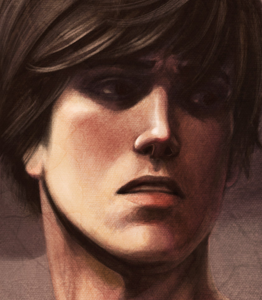
I tend to picture my characters in very high detail, at least in part because I'm an artist by profession.  While I haven't drawn Riley from Art of Death yet, I can see him in my mind like an photo in a yearbook.  I can see down to the shape of his chin, the amount of wave in his hair, the length of his sideburns, the way the shadows fall below his cheekbones.  I know his build and what he would wear.  I don't necessarily describe my characters in this much detail while writing, but it's always there in the back of my mind.

The more I write a character, the clearer the image in my head becomes.  I don't see supporting characters quite as clearly as the leads, and even the leads are unclear until I have a chance to get to know them.

Again because I'm an artist, I often sketch my characters just for the fun of it.  But ironically, the way I sketch them is almost never the way I picture them in my head.  When I work on a graphic novel, the characters have a distinct look, and it's my job to stay as consistent as possible.  But when I draw characters from my prose novels, they're likely to look different every time I draw them, depending on my mood at the time.

A good example of this is the cover for The Dragon Tamer.  The way I drew Aedan on the cover is not quite the way I picture him in my head.  This was deliberate; I wanted a powerful image for the cover with as much universal appeal as possible, so I adjusted his features accordingly.  I've drawn Aedan three times, and each of those times, he could have been an entirely different character.

I'd be curious to know how readers picture Drake from the Dragon Tamer.  His appearance is never described in the story.  It's inspiring to know, based on feedback so far, that readers didn't necessarily need a physical description in order to like him.

I may post drawings of my characters from time to time, but I don't consider my own drawings to carry any more truth or authenticity than fan art.  If I share my drawings, it's just for fun, not to inform anyone of how my characters "really" look.  The beauty of fiction is everyone can picture a character differently, and they can even change their minds from morning to evening.

Sunday, February 12, 2012

Progression Shots


Progression shots for the cover of my short story, The Dragon Tamer.  I shared these at my Meet the Author event.  Now sharing them here.


(P.S. The colors look sad due to gif compression.  Actual image can be found in my previous posts.)